
Follow

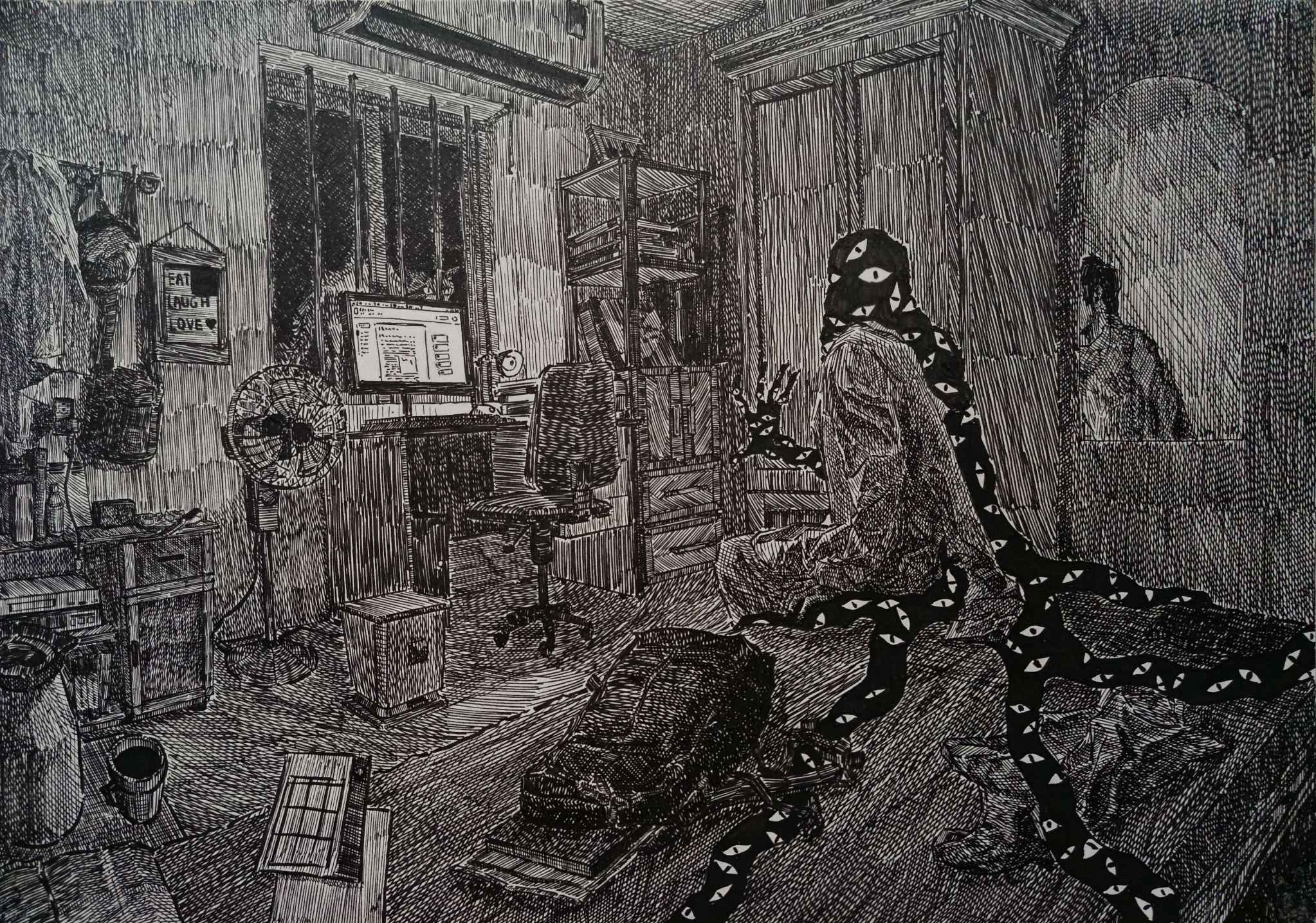
@wanderingmeomeo i like your composition! you’ve got a nice spacing of objects to draw the eye around the image without distracting from the main subject
if you’re trying to improve readability though i might suggest working on increasing the range of your mid tones — i always struggled with my mid tones all being too mid-y when i was working with charcoal / graphite and it can definitely make things muddle together / fade into the background more than they should

@Satsuma
Thank you, it's still too hard for me to be flexible with the midtones with my brush pen. I feel like either I have to buy a pen with a more versatile but consistent line weight, or just different pens with different nib size all together.
Btw, I also had an earlier version of this artwork made by charcoal, but trying to squeeze in details is a pain since I'm not good at controlling it yet, so I abandoned it to switch to the brush pen.